



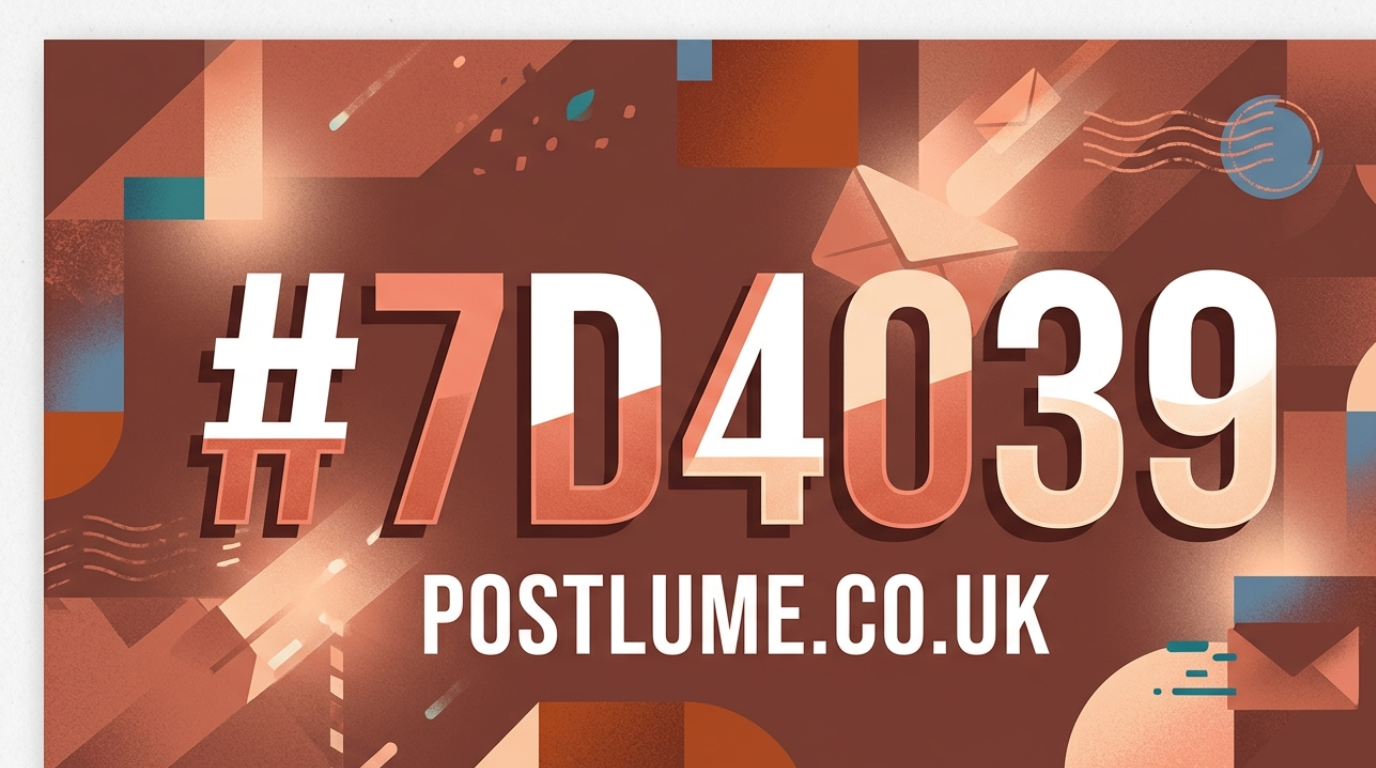
The hex color code #7d4039 is a warm, deep reddish-brown shade widely used in digital design, branding, interior styling, and web development. When people search for “#7d4039,” they are usually trying to understand what color it represents, how it is used in design systems, or what emotional tone it creates in visual projects.
In simple terms, #7d4039 is a muted earthy color that sits between red, brown, and maroon tones. It is often associated with stability, warmth, and natural aesthetics. Because of its balanced saturation and depth, it is commonly used in luxury branding, UI design accents, and background themes where a grounded visual feel is needed.
What Is the #7d4039 Hex Color Code?
The color #7d4039 is a hexadecimal representation of an RGB color value used in digital systems like websites and graphic design tools. In RGB format, it translates to red 125, green 64, and blue 57. This combination creates its signature warm, earthy tone.
In color science terms, #7d4039 is classified as a dark warm shade with medium saturation and relatively low brightness. It contains more red than green and blue, which is why it appears as a reddish-brown or brick-like tone on screens. This structure makes it ideal for designs that require depth and warmth.
Color Characteristics and Technical Breakdown
From a technical perspective, #7d4039 has a hue value of approximately 6 degrees, meaning it sits very close to red on the color wheel. It also has moderate saturation, giving it a slightly muted appearance rather than a bright red tone.
The brightness level is relatively low, which makes it a darker shade suitable for backgrounds, accents, and premium design themes. In CMYK printing, it contains high levels of magenta and yellow, which contribute to its warm earthy appearance. This combination is why it often resembles natural materials like clay, wood, or leather.
Visual Appearance and Real-World Color Description
Visually, #7d4039 is often described as a deep terracotta, rustic brown, or dark brick red. It does not appear overly bright or sharp; instead, it delivers a grounded and organic feel that works well in both digital and physical design environments.
In real-world comparisons, this shade is similar to aged wood, dark clay pottery, or vintage leather tones. Designers often choose it when they want to create a sense of tradition, craftsmanship, or natural elegance without using overly bright colors.
Psychological Meaning of #7d4039 Color
Color psychology plays an important role in how #7d4039 is perceived. Because it is a warm earthy tone, it often conveys feelings of stability, comfort, and reliability. Red-based browns like this are frequently associated with strength and grounded energy.
At the same time, the muted nature of the color reduces aggression typically associated with pure red. This makes it more balanced and suitable for professional or luxury environments where emotional warmth is needed without intensity.
Popular Uses of #7d4039 in Design and Branding
In modern design, #7d4039 is widely used in branding, packaging, and web interfaces. Luxury brands and lifestyle companies often use similar tones to create a premium, earthy aesthetic. It works especially well for organic products, coffee brands, leather goods, and artisanal businesses.
Web designers also use this color as an accent for buttons, headers, and background elements because it provides strong contrast with lighter tones. Its versatility makes it suitable for both minimalist and vintage-inspired design systems.
#7d4039 in Web Design and UI Applications
In user interface (UI) design, #7d4039 is often applied to create depth and visual hierarchy. It is commonly used for navigation bars, highlight elements, and hover states in modern websites. Its darker tone helps improve readability when paired with light text colors.
Because it is not overly saturated, it maintains visual comfort even when used in large sections of a webpage. Designers prefer it in interfaces where they want a natural, warm feel instead of a cold or overly technical appearance.
Color Harmony and Pairing with Other Shades
The #7d4039 color pairs well with neutral tones such as beige, cream, soft white, and light gray. These combinations help balance its intensity and make it more visually appealing in design layouts. It also works well with earthy greens and muted blues for natural-themed palettes.
In contrast-based design systems, it is often paired with lighter warm shades to create depth and separation between elements. This makes it useful for both background layering and accent highlighting in digital compositions.
Conclusion: Why #7d4039 Is a Powerful Design Color
The hex color #7d4039 is more than just a digital code; it is a versatile warm tone that blends red and brown characteristics into a balanced earthy shade. Its technical structure, emotional impact, and design flexibility make it a valuable choice for modern creatives.
Whether used in branding, web design, or product aesthetics, #7d4039 delivers a sense of warmth, stability, and sophistication. Its subtle richness ensures it remains a popular choice in both minimalist and luxury design environments.
